How to Reduce Sign Up Flow Drop-Off

Jan 3, 2024
-minute read
Last Updated: May 4, 2026
Digital Identity & Customer Authentication

Every abandoned sign up flow represents a lost customer, a missed revenue opportunity, and a signal that something in your registration experience needs attention. For businesses investing heavily in acquisition, watching potential users walk away at the final step is a costly problem. The question organizations keep asking is straightforward: why do customers abandon the sign up flow, and how can I reduce that drop-off?

This challenge sits at the intersection of identity security and customer experience. We see firsthand how the registration process shapes a user's perception of a brand. A clunky sign up page design drives people away, while a streamlined, trust-building experience converts visitors into loyal customers. The good news is that reducing form abandonment does not require a complete overhaul. It requires understanding where friction lives and removing it strategically.

Let's walk through the most common reasons users abandon the sign up process, share actionable best practices to reduce drop-off, and highlight real sign up page examples from companies that get it right.

Key Takeaways


  • Fewer fields, more completions: Reducing the number of form fields to only what is essential at registration is the single most effective way to lower sign up flow drop-off.

  • Trust is earned in seconds: Users make snap judgments about security and legitimacy. Clear branding, privacy messaging, and social login options build confidence quickly.

  • Progressive profiling beats long forms: Collecting information gradually across multiple interactions creates a frictionless onboarding experience without sacrificing the data you need.

  • Testing drives continuous improvement: A/B testing your sign up flow reveals what actually works for your audience, replacing assumptions with evidence.

Why Customers Abandon the Sign Up Flow

Understanding why users leave is the first step toward fixing the problem. Sign up flow abandonment rarely comes down to a single issue.2 Instead, it is usually a combination of friction points that stack up until the user decides the effort is not worth the reward. Let's look at the most common causes.


Too many form fields

This is the most frequent offender. When users encounter a long registration form asking for information that feels unnecessary (phone number, company size, and job title) before they have even experienced the product, many will leave. Every additional field increases cognitive load and raises the question: "Why do they need this?"1 The best sign up page examples keep initial fields to an absolute minimum, often just an email address and password.


Unclear value proposition

If your sign up page does not clearly communicate what the user gains by registering, motivation drops. Users need to understand the benefit before they invest time in the sign up process. A generic "Create an Account" headline does far less work than a specific statement about what awaits on the other side of registration.


Security and trust concerns

Users are increasingly aware of data privacy risks and account creation fraud. A sign up page design that lacks trust signals (security badges, privacy policy links, recognizable branding) can trigger hesitation. If users are unsure whether their data is safe, they will abandon the form rather than take a chance. This is especially true for lesser-known brands or when the registration asks for sensitive information early in the process.

Best Practices to Reduce Sign Up Flow Drop-Off

Now that we understand the barriers, let's focus on what works. These eight practices address the root causes of form abandonment and create a smoother path from visitor to registered user. Each one contributes to a sign up flow that respects the user's time and builds trust from the first interaction.


Minimize form fields

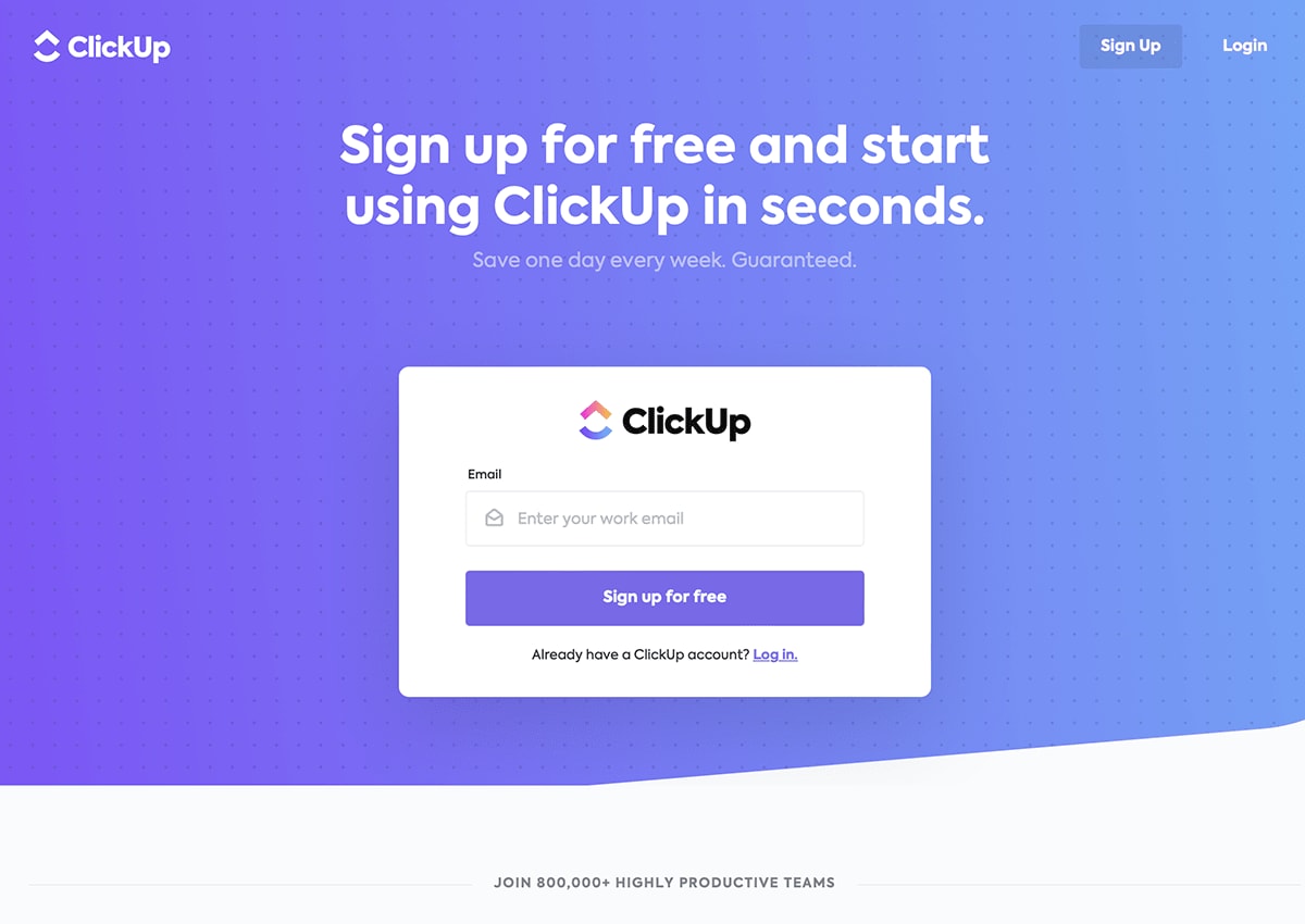
Start by asking only for what you absolutely need at the point of registration. For most applications, that means an email address and a password. Everything else can come later through progressive profiling or in-app prompts. ClickUp demonstrates this well with a sign up page that asks for just the essentials, removing barriers to entry while still collecting enough data to create an account.


A signup page for ClickUp a project management tool


Offer social and SSO sign up options

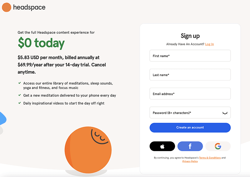
Giving users the option to register with an existing account (Google, Apple, or a corporate single sign-on (SSO) provider) dramatically reduces friction. Users avoid creating yet another password, and you benefit from verified identity data from the start. Headspace offers a clean example of social sign up integration, presenting multiple authentication options without overwhelming the user.


A signup page for Headspace which is a meditation app


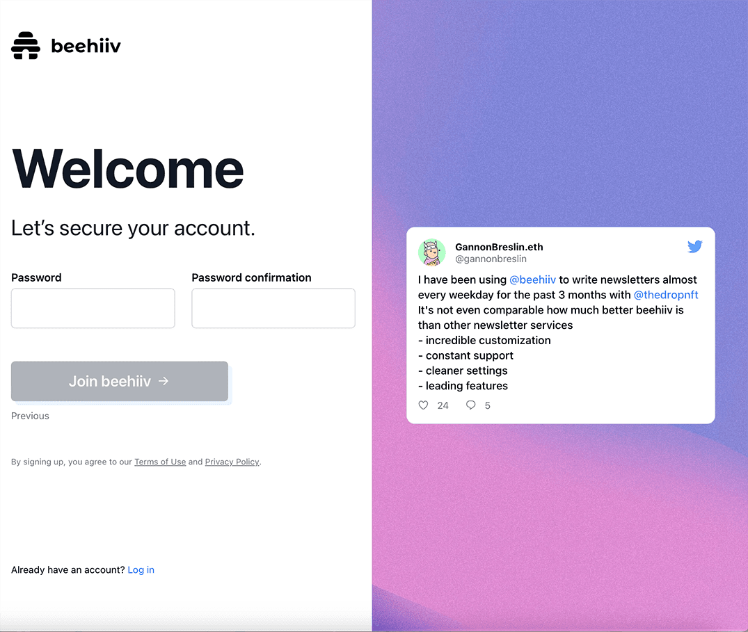
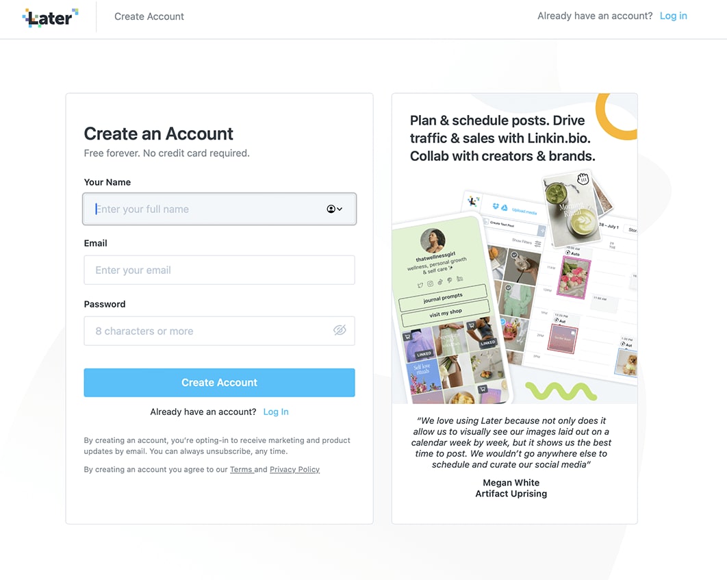
Use progressive profiling

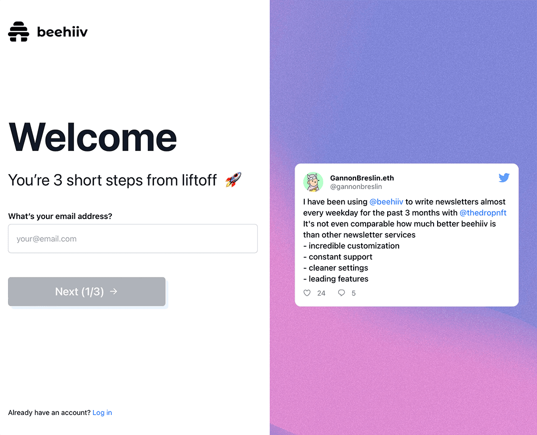
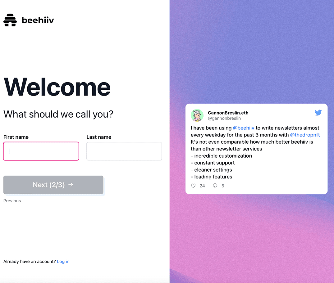
Rather than asking for everything upfront, collect information gradually. Progressive profiling breaks the registration into small, manageable steps. Each step asks for just one or two pieces of information, making the process feel lighter. Beehiiv executes this approach effectively, walking users through a sequence that starts with email, then name, then password, with each screen feeling quick and approachable.


Beehiiv signup email
Beehiiv signup name
Beehiiv signup password


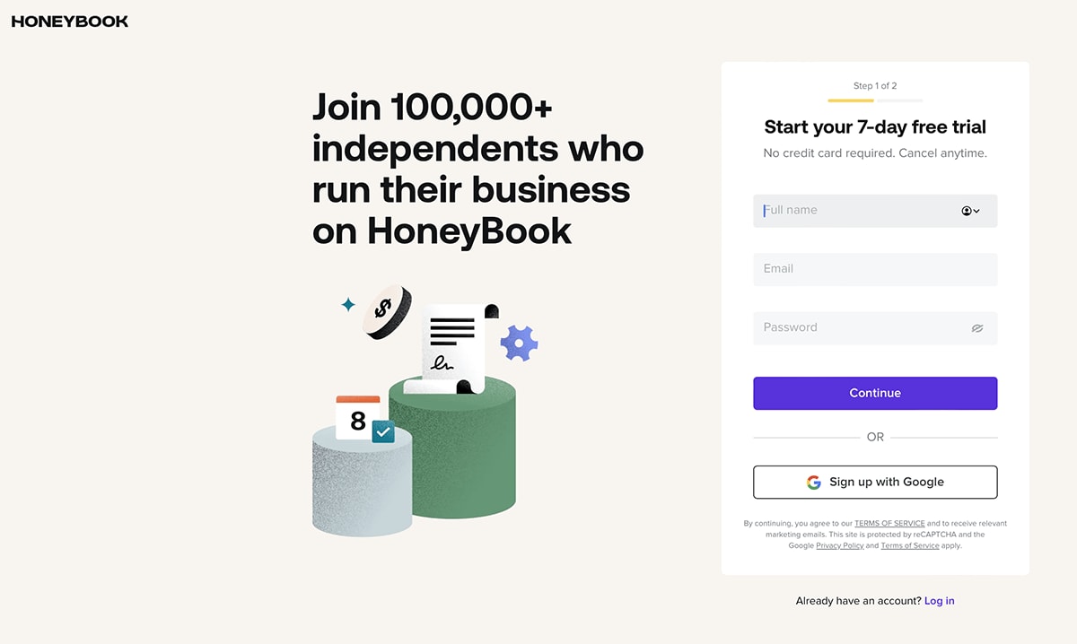
Add progress indicators

When a sign up process requires multiple steps, a progress bar or step indicator reassures users that the end is in sight. Without this visual cue, users may assume the form is longer than it actually is and leave. HoneyBook uses a clear progress indicator that shows users exactly where they are in the registration journey, reducing uncertainty and encouraging completion.
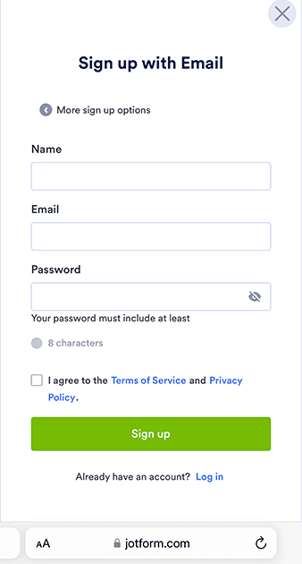
 

A signup form for HoneyBooks


Optimize for mobile

A significant portion of sign up attempts happen on mobile devices. If your sign up page design is not responsive, loads slowly, or requires excessive scrolling and typing, mobile users will drop off at higher rates.3 Jotform provides a mobile-optimized sign up experience with large tap targets, minimal scrolling, and fields that adapt to smaller screens.


A signup page for Jotform


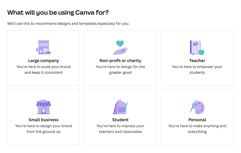
Personalize the onboarding experience

Tailoring the sign up flow based on user intent or segment makes the process feel relevant rather than generic. Canva excels at this by asking new users about their intended use case (personal, education, and business) and adjusting the subsequent onboarding steps accordingly. This frictionless onboarding approach ensures users see value immediately after registration.


Canva signup email
Canva signup use case
Canva signup team
Canva signup pro trial


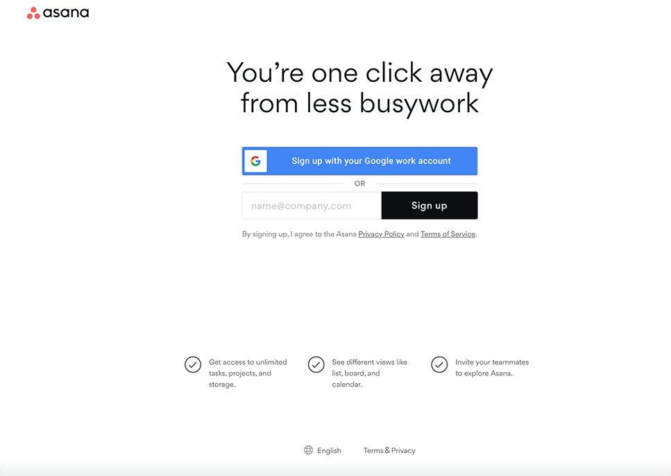
Use specific calls to action

Generic buttons like "Submit" or "Sign Up" miss an opportunity to reinforce value. A specific call to action (CTA) that reflects what the user gets ("Start your free trial" or "Get started for free") creates a stronger incentive to click. Asana uses action-oriented CTA language that connects the button directly to the benefit, making the final step feel like a reward rather than a transaction.


A signup form for Asana


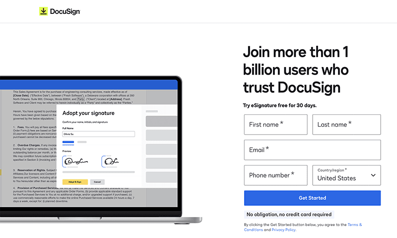
A/B test your sign up flow

What works for one audience may not work for another. A/B testing different elements of your sign up page (field count, CTA wording, layout, social login placement) gives you data to make informed decisions. DocuSign demonstrates the value of testing by running variations of its registration page to identify which design and messaging combinations yield the highest completion rates.


DocuSign signup variation 1
DocuSign signup variation 2

Sign Up Flow Examples That Reduce Drop-Off

Seeing these principles in action helps illustrate what an effective sign up flow looks like in practice. Here are four companies that stand out for their approach to reducing registration friction.


Later (clear value proposition): Later's sign up page immediately communicates what the user gains by registering. Instead of a generic headline, the page highlights the platform's core benefit, giving users a compelling reason to complete the form. The value proposition is front and center, not buried below the fold.


A signup page for Later a social media management tool

ClickUp (minimal fields): ClickUp strips the registration form down to the essentials. By asking for only the information needed to create an account, they remove the cognitive burden that causes users to abandon longer forms. The result is a sign up process that takes seconds rather than minutes.


Beehiiv (progressive profiling): Beehiiv's multi-step approach breaks what could be a lengthy form into bite-sized pieces. Each step feels quick and easy, and the user never sees the full scope of information being collected. This approach maintains momentum and keeps completion rates high.


Canva (personalized onboarding): Canva turns the sign up flow into a personalization opportunity. By asking users about their goals during registration, Canva tailors the post-registration experience to match. Users feel understood from the start, which builds engagement and reduces early churn.

Strengthen Your Sign Up Flow With Verified Identity

Reducing friction in the sign up process is only half the equation. The other half is making sure the users who register are real. Fraudulent account creation costs businesses time and money, and it undermines trust for legitimate users. With modern IAM, organizations can solve both challenges at once.


With capabilities like continuous identity verification and no-code journey orchestration, Ping enables you to build sign up flows that confirm a user's real-world identity without adding friction to the experience. You can verify new accounts at the moment of creation, stop synthetic identity fraud before it starts, and deliver a registration experience that is both secure and seamless. Adaptive multi-factor authentication (MFA) adds another layer of protection, stepping up security only when risk signals warrant it.


The result is a sign up flow that earns user trust, reduces abandonment, and protects your business from the start.


  1. Baymard Institute, "50 Cart Abandonment Rate Statistics 2026"

  2. FormStory, "Form Abandonment Statistics: Reasons, Industries, Key Facts"

  3. Nielsen Norman Group, "Mobile UX Design Best Practices"


Frequently Asked Questions

Customers abandon sign-up flows primarily because of too many form fields, unclear value propositions, and a lack of trust signals. When registration feels like more effort than the perceived reward, users leave. Reducing friction and clearly communicating benefits are the most effective ways to keep users engaged through completion.

A sign up page should include as few fields as possible, ideally just an email address and a password. Additional information can be collected later through progressive profiling. Keeping your initial form short lowers the barrier to entry and improves completion rates.

Form abandonment rates vary by industry and form length, but they are generally high across most sectors. Longer forms with more fields tend to see significantly higher drop-off. The most effective way to lower your abandonment rate is to reduce fields and simplify the overall sign up process.

Social login reduces friction by letting users register with an existing account from providers like Google or Apple, eliminating the need to create a new username and password. This speeds up the sign up process and reduces the cognitive effort required. It also provides verified identity data, which benefits both security and user experience.

Progressive profiling is a strategy that collects user information gradually across multiple interactions rather than all at once during registration. Instead of presenting a lengthy form, you ask for a few details at sign up and gather the rest over time. This approach reduces form abandonment while still building a complete user profile.

Share this Article:
Related Resources

Start Today

See how Ping can help you deliver secure employee, partner, and customer experiences in a rapidly evolving digital world.